list-style-type : 리스트 앞의 모양에 스타일을 줄 수 있다
<style type="text/css">
ul{
	list-style-type: square;
}

ol{
	list-style-type: upper-latin;
}
</style>
</head>
<body>
<ul>
	<li>가나다</li>
	<li>라마바</li>
</ul>
<ol>
	<li>ABC</li>
	<li>DEF</li>
</ol>

</body>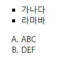
리스트 모양으로 이미지도 줄 수 있음
ul{
	list-style-image: url('cat.png')
}
list-style-position : 리스트를 어디에 정렬할 것인지
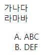
list 일반 글자처럼 보이게하기
<head>
<meta charset="UTF-8">
<title>Insert title here</title>
<style type="text/css">
ul{

	list-style-type: none;
	margin: 0;
	padding: 0;
}

ol{
	list-style-type: upper-latin;
}
</style>
</head>
<body>
<ul>
	<li>가나다</li>
	<li>라마바</li>
</ul>
<ol>
	<li>ABC</li>
	<li>DEF</li>
</ol>

</body>
</html>
margin : 0 ;
padding : 0;
↓ list-style-type: none; ↓
border-collapse : 표(table)의 테두리와 셀(td)의 테두리 사이의 간격을 어떻게 처리할 것인가
separate : 표(table)의 테두리와 셀(td)의 테두리 사이에 간격을 둔다
collapse : 표(table)의 테두리와 셀(td)의 테두리 사이의 간격을 없앱니다. 겹치는 부분은 한 줄로 냄
inherit : 부모 요소의 속성값을 상속
<head>
<meta charset="UTF-8">
<title>Insert title here</title>
<style type="text/css">
table{
border-collapse: separate;
border-spacing: 10px;
border: 1px solid #444;
}
th{
border: 1px solid #444;
}
td{
border:1px solid #444;
}
</style>
</head>
<body>
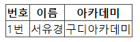
<table>
<thead>
<tr>
<th>번호</th>
<th>이름</th>
<th>아카데미</th>
</tr>
</thead>
<tbody>
<tr>
<td>1번</td>
<td>서유경</td>
<td>구디아카데미</td>
</tr>
</tbody>
</table>
</body>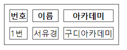
↑ border-collapse: separate; ↑
border-spacing: 10px;
표와 셀간격 10px을 주겠다
↑ border-collapse: collapse; ↑
셀과 테두리 사이의 간격을 없애고 겹치는 부분은 한 줄로 주겠다
p: nth-child(N) => p요소의 자식인덱스 N번의 요소
<title>Insert title here</title>
<style type="text/css">
table{
	border-collapse: collapse;
}
tr{
	border-top: 1px solid #444;
	border-bottom: 1px solid #444;
}
td:nth-child(1), th:nth-child(1){
	width: 100px;
	text-align: center;
}
td:nth-child(2), th:nth-child(2){
	width: 200px;
	text-align: center;
}
td:nth-child(3), th:nth-child(3){
	width: 300px;
	text-align: center;
}
</style>
</head>
<body>
<table>
	<thead>
		<tr>
			<th>번호</th>
			<th>이름</th>
			<th>아카데미</th>
		</tr>
	</thead>
	<tbody>
		<tr>
			<td>1번</td>
			<td>서유경</td>
			<td>구디아카데미</td>
		</tr>
		<tr>
			<td>2번</td>
			<td>가나다</td>
			<td>구디아카데미</td>
		</tr>
		<tr>
			<td>3번</td>
			<td>라마바</td>
			<td>구디아카데미</td>
		</tr>
		<tr>
			<td>4번</td>
			<td>아자차</td>
			<td>구디아카데미</td>
		</tr>
		<tr>
			<td>5번</td>
			<td>카타파</td>
			<td>구디아카데미</td>
		</tr>
		<tr>
			<td>6번</td>
			<td>하~!</td>
			<td>구디아카데미</td>
		</tr>
	</tbody>
</table>
</body>
↑ td:nth-child(1), th:nth-child(1) ↑
{ width: 100px;
text-align: center; }
td의 첫번째 자식과 th의 첫번째 자식에 width를 100px주고 텍스트는 가운데 정렬하겠다
width 특성상 같은 열애들은 가장 큰 크기를 따라가기때문에 아래 td들은 자동으로 width 맞춰짐
tbody tr:nth-child(odd){
	background-color: #CECECE;
}
tbody tr:hover{
	background-color: orange;
	cursor: pointer;
}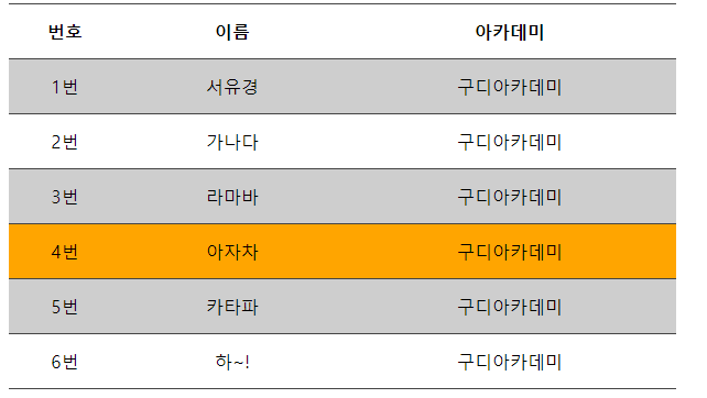
↑ tbody tr:nth-child(odd){ ↑
background-color: #CECECE; }
tbody tr:hover{
background-color: orange;
cursor: pointer; }
tbody에 있는 tr의 홀수번(odd)째 애들의 backgrond-color를 #CECECE로 지정하겠다
tbody의 tr에 마우스커서가 올라갔을 때 background-color는 오렌지로 마우스커서는 포인터로 하겠다.
https://www.w3schools.com/cssref/pr_class_cursor.asp => 커서모양필요하면 보기
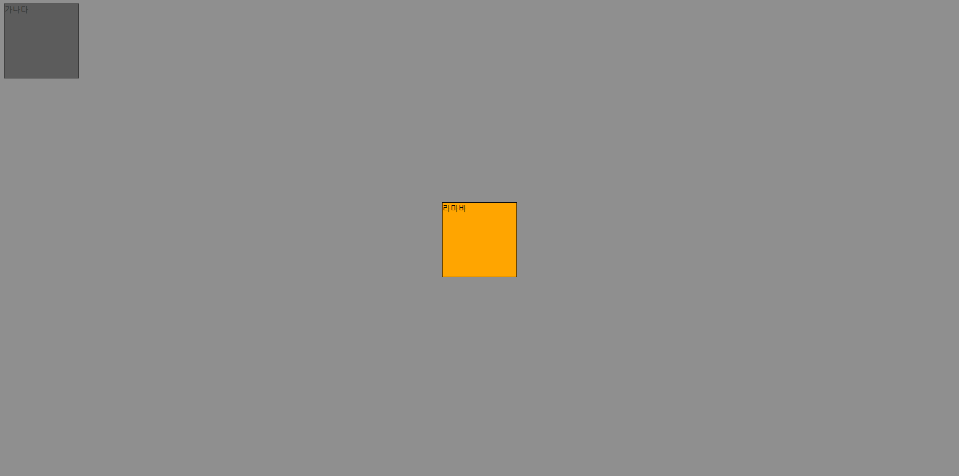
display : none; => display속성을 none으로 설정하여 요소를 숨길 수 있다.
요소가 숨겨지고 요소가 없는 것처럼 페이지가 표시됨.
<!DOCTYPE html>
<html>
<head>
<meta charset="UTF-8">
<title>Insert title here</title>
<style type="text/css">
.a,.b,.c{
	display: inline-block;
	vertical-align: top;
	width: 148px;
	height: 148px;
	border: 1pt solid #000;
}
.a{
	display: none;
}
</style>
</head>
<body>
<div class="a"></div>
<div class="b"></div>
<div class="c"></div>
</body>
</html>
↑ a 클래스는 페이지에 나타나지않음 ↑
display: none과 비슷한 걸로 visibility: hidden; 이 있음
.b{
	visibility: hidden;
}
↑ display:none과 다르게 공간을 차지하고 있음 ↑
세로정렬
<head>
<meta charset="UTF-8">
<title>Insert title here</title>
<style type="text/css">
.a,.b,.c{
display: inline-block;
vertical-align: top;
width: 148px;
height: 148px;
border: 1pt solid #000;
}
.a{
display: none;
}
.b{
visibility: hidden;
}
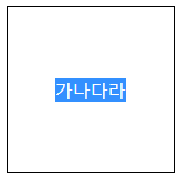
.c{
line-height: 150px;
text-align:center;
}
</style>
</head>
<body>
<div class="a"></div>
<div class="b"></div>
<div class="c">가나다</div>
</body>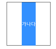
↑ .c{ line-height: 150px; ↑
text-align:center; }
세로 정렬이 되긴했지만 한 줄일때만 사용이 가능하다 공간을 혼자 공간을 너무 많이 차지함
display : table-cell; => 테이블 요소를 td 속성으로 바꿔주는 역할
table표 안에 있는 것처럼 바꿔서 쉽게 정렬 할 수 있게 할때 쓰인다.
td에서 정렬은 text-align:center; vertical-align:middle; 으로 간단하게 가로/세로
정렬이 가능하다. 여러줄 가능 !
.d>div{
	display: table-cell;
	text-align:center;
	vertical-align: middle;

}
inline-table : 인라인 블록안에 테이블을 만듦
.d{
	display: inline-table;
	width: 150px;
	height: 150px;
	border: 1px solid #000;
}
이거 잘 모르겠다 뭐가 변하는거지 ? 일단 이걸 안쓰면 .d>div요소가 세로정렬이 되지않음
글자만큼영역을 테이블로 주겠다 ?
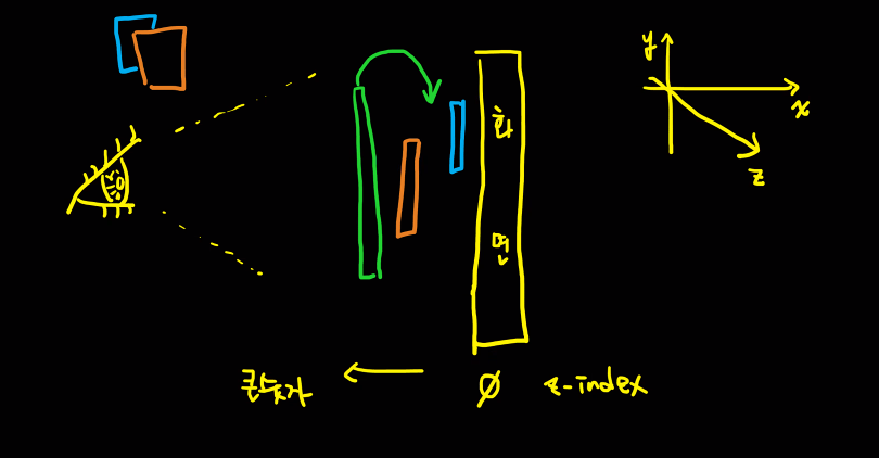
Position
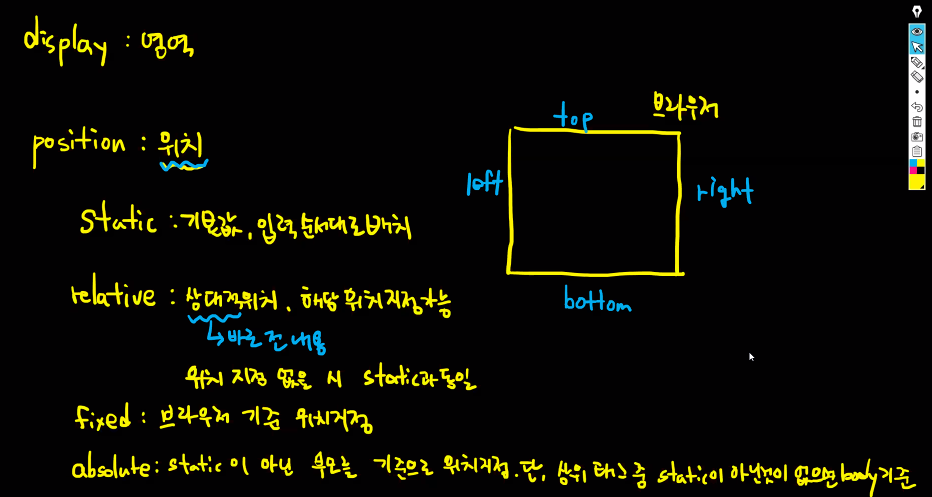
absoulte 항상 Z-index와 함께 사용
<head>
<meta charset="UTF-8">
<title>Insert title here</title>
<style type="text/css">
.a,.b{
	display:inline-block;
	vertical-align: top;
	width:148px;
	height:148px;
	border: 1px solid #000;
}
.a{
	background-color: gray;
}
.b{
	background-color: orange;
	position: absolute;
	top: 50px;
	left: 50px;
}
</style>
</head>
<body>
<div class ="a">가나다</div>
<div class ="b">라마바</div>
</body>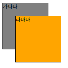
absolute는 static이 아닌 부모를 기준으로 위치를 지정하지만 현재 코드에선 부모가 없음 그럴땐 바디를 기준으로 함.
오렌지박스는 그래서 바디기준 top left가 50px 떨어진 곳에 위치하고있다.
위치지정할때 px가 아닌 %로 주어도된다. ↓
.b{
	background-color: orange;
	position: absolute;
	top: 50%;
	left: 50%;
}
↓ output ↓
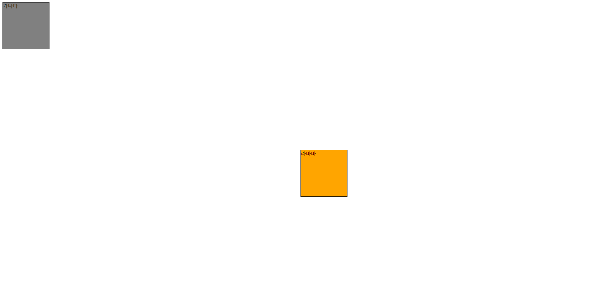
오렌지박스가 뭔가 정가운데가 아니다. 저렇게 출력되는 이유는 바디의 top, left를 50%씩 띄고 출력되었기때문 50%위치에 주었지만 현재 오렌지박스는 화면의 정가운데가 아니다. 아래사진 참고
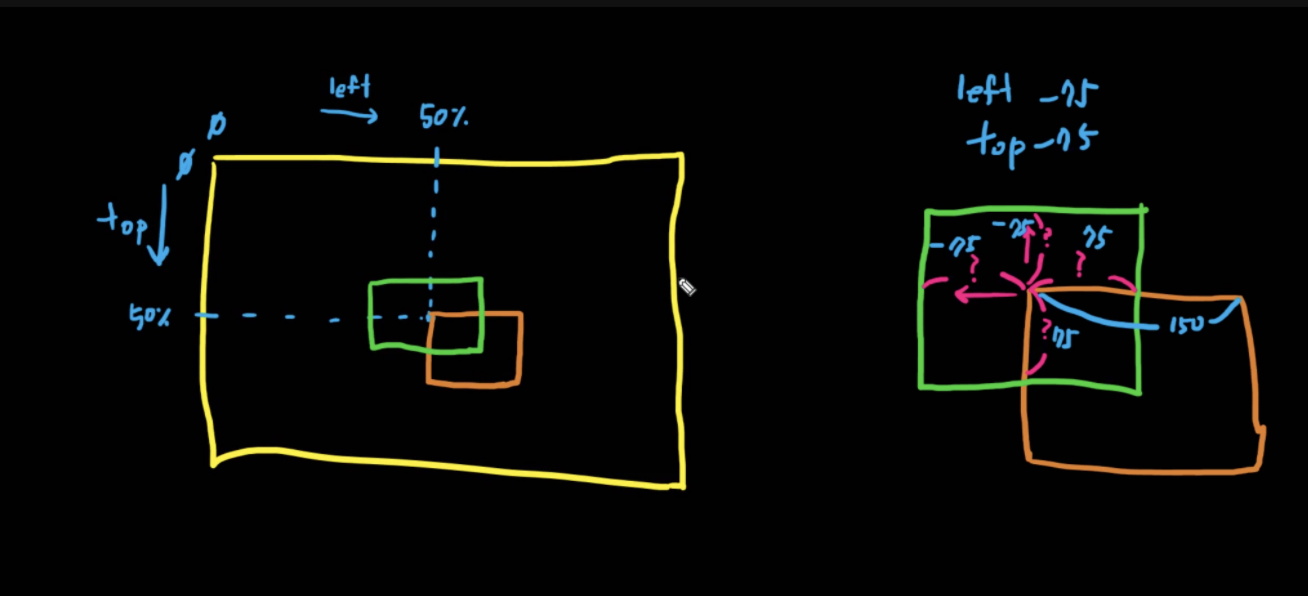
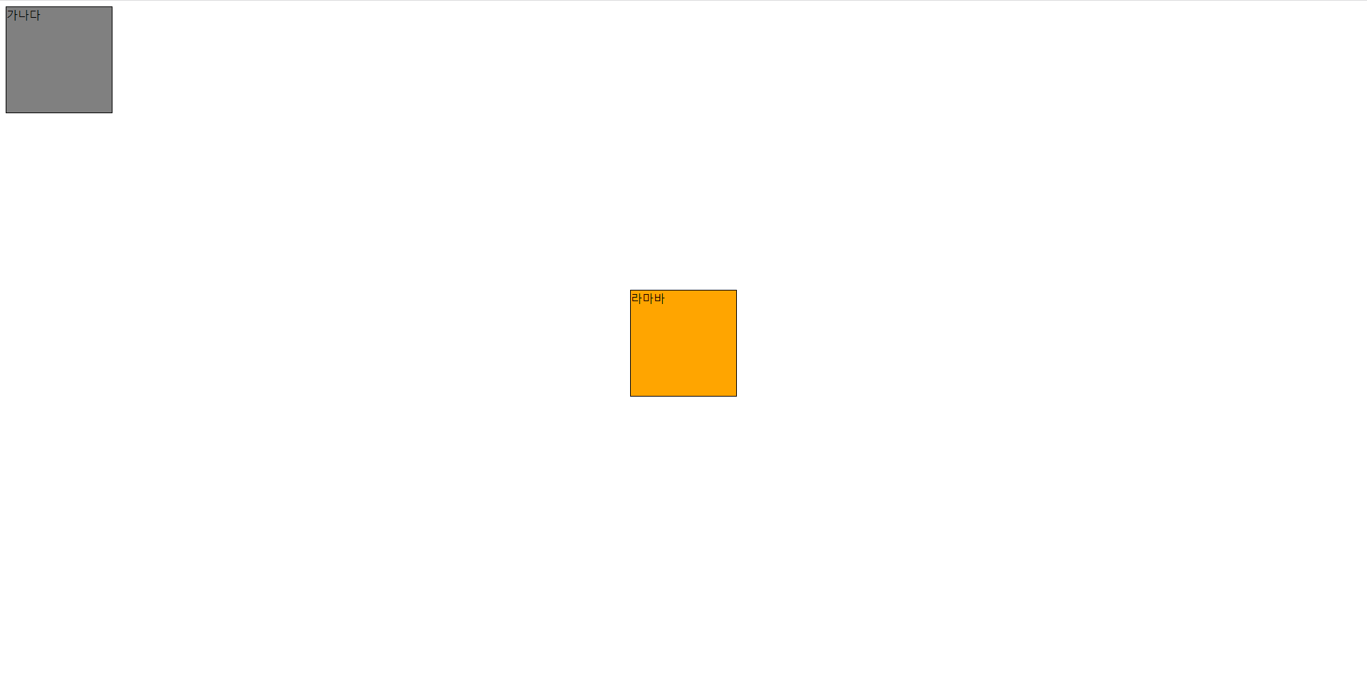
그래서 -75px를 해주면 정가운데에 위치할 수 있다.
.b{
	background-color: orange;
	position: absolute;
	top: 50%;
	left: 50%;
	top: calc(50% - 75px);
	left: calc(50% - 75px);
}
calc 사용할 때 부호값의 구분을 띄어쓰기로 함. 하지않으면 제대로 적용안됨 주의하기
calc 를 사용해도 되고 margin을 -75px줘도 됨
.b{
	background-color: orange;
	position: absolute;
	top: 50%;
	left: 50%;
	/* top: calc(50% - 75px);
	left: calc(50% - 75px); */
	margin-top: -75px;
	margin-left: -75px;
}
↓output↓
Z-index : 차곡 차곡 덮혀씌워져 있는 것을 화면으로 바라 본 것. Z-index의 숫자가 클수록 우리 눈에 더 잘보인다.
opacity : 투명도 0.0 ~ 1.0
↓ z-index사용 ↓
<head>
<meta charset="UTF-8">
<title>Insert title here</title>
<style type="text/css">
.a,.b{
	display:inline-block;
	vertical-align: top;
	width:148px;
	height:148px;
	border: 1px solid #000;
}
.a{
	background-color: gray;
}
.b{
	background-color: orange;
	position: absolute;
	top: 50%;
	left: 50%;
	/* top: calc(50% - 75px);
	left: calc(50% - 75px); */
	margin-top: -75px;
	margin-left: -75px;
    z-index:100;
}
.bg{
	position: absolute;
	width: 100%;
	height: 100%;
	top: 0px;
	left: 0px;
	background-color: #444;
	z-index :50;
	opacity: 0.6;
}
</style>
</head>
<body>
<div class ="a">가나다</div>
<div class ="b">라마바</div>
<div class="bg"></div>
</body>↓output↓
이걸 활용해서 팝업창을 생성 할 수 있음
float : 어느방향으로 적재되어 흘러갈지
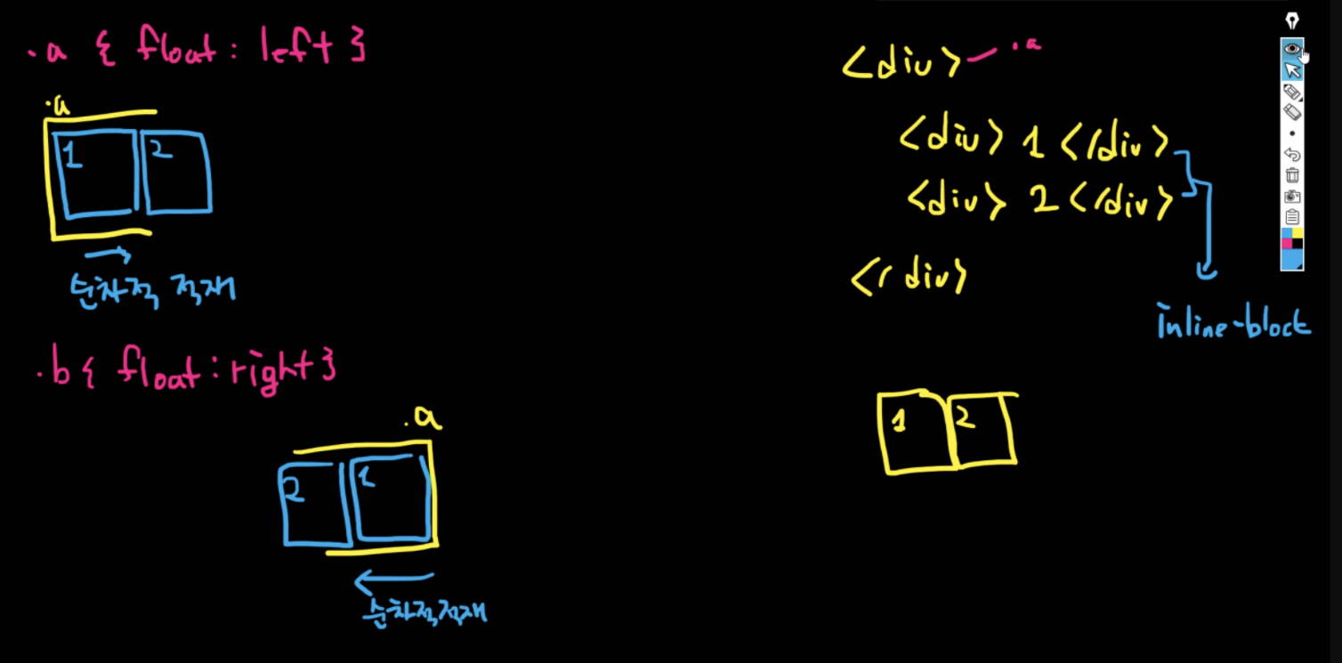
float: left => 디폴트 값. 설정해주지 않아도 됨 왼쪽부터 왼쪽으로 적재
float: right => 오른쪽 방향부터 적재되어 오른쪽으로 흐르겠다. 먼저들어간게 오른쪽부터 배치되어 순서가 거꾸로 됨


